Case Study: New Website
Data driven design leads to an increase of 53% in organic search and 86% increase in pages viewed per session
Three months after the website launch
53%
Organic Search increased
40%
Pageviews increased
98%
Bounce rate improved
36%
Average Session Duration improved
86%
Pages viewed per session increased
Problem
Champion Fiberglass was looking to revamp their website and bring the site up to current best practices from the backend to front-end/user experience. They wanted better UX, better performance and an easier navigation so users can better find content and helpful information including resources and inventory pages.
Strategy
The purpose of Champion Fiberglass’ website redesign was to bring the site up to current best practices from the backend to the front-end/end user experience. The current site was last built in 2016, WordPress had made many changes, and the digital landscape had also changed. With Champion’s rich library of content and complex industries they serve, the website redesign focused on designing an intuitive and dynamic content flow for audiences while implementing Champion’s rebrand. By strategically leveraging current best practices, we were able to implement Gutenberg with WordPress, update Champion’s site architecture for intuitive and user-friendly UI/UX, and establish a mobile-friendly site.
Results after the redesign
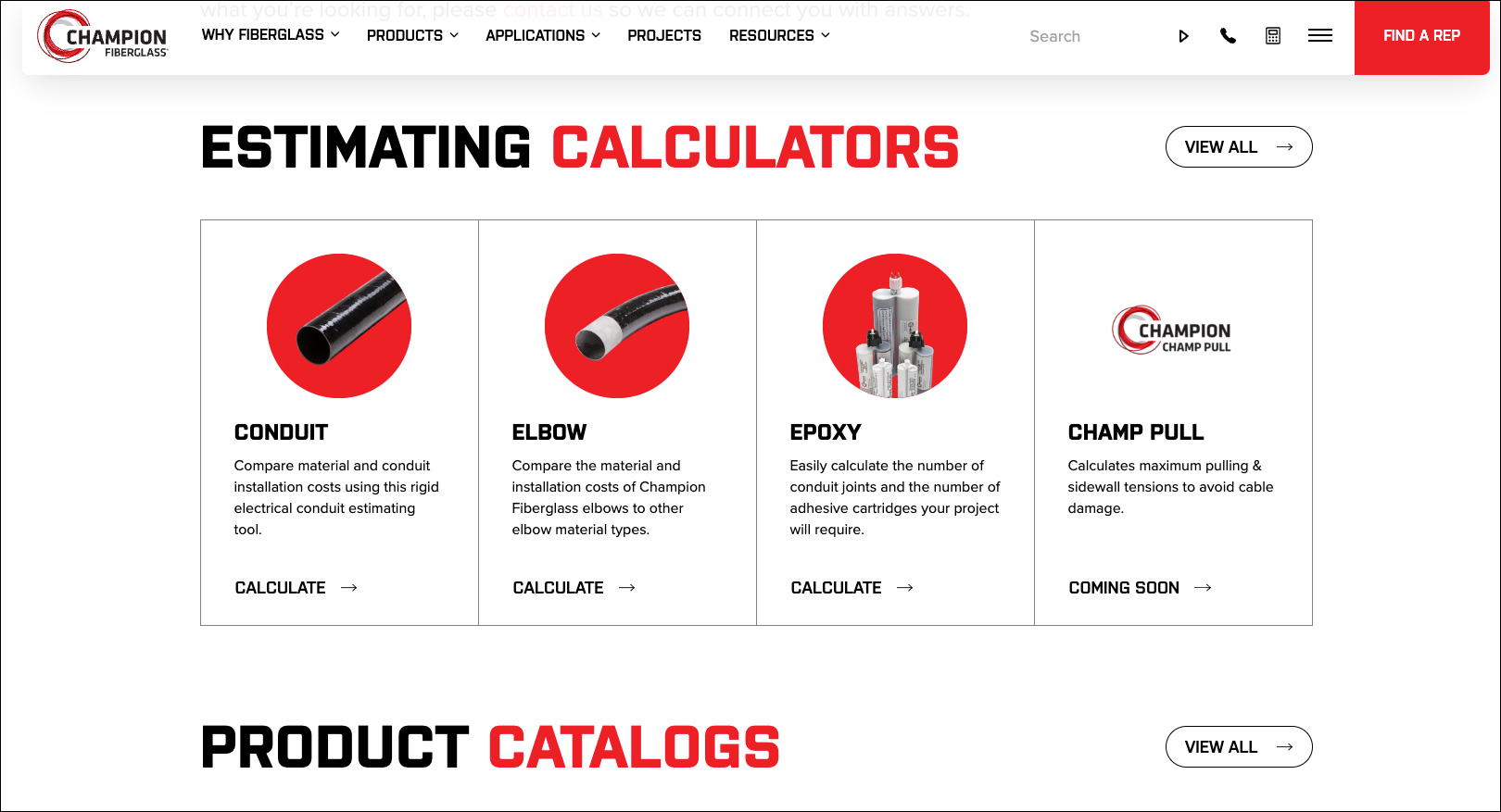
The new Champion Fiberglass website represents a professional, innovative, and a powerful visual testament to their capabilities. Exciting new content areas like the project pages build out their company story and the Strut inventory page makes it easy for customers to find parts with live inventory counts. The blog page uses intuitive category search filters to help visitors navigate their deep collections of content. The overall visitor experience is efficient, with clear paths to content and more concise menu options. And it’s easy for visitors to get to know the people behind Champion Fiberglass with their richly detailed About Us page.
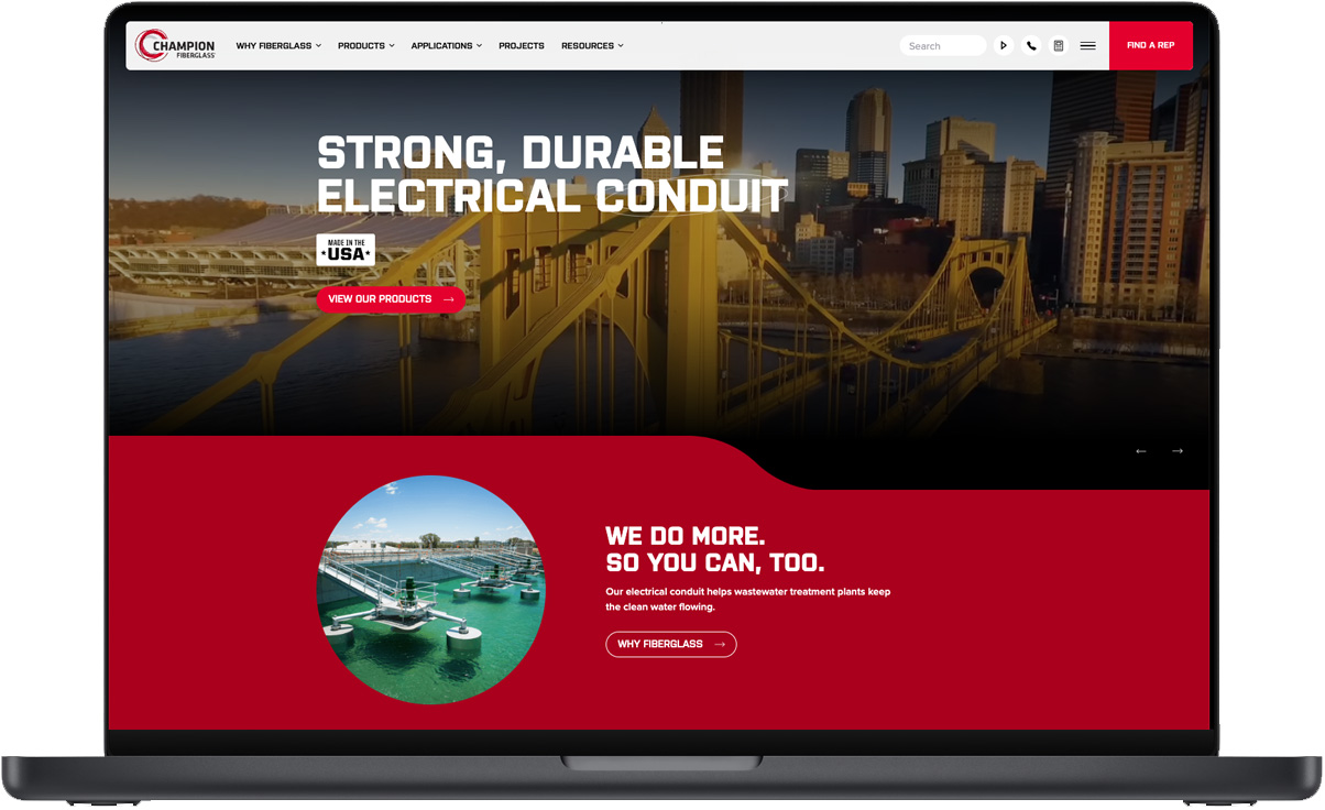
Homepage
The old site was text-heavy, which detracted from the company’s updated bold and modern branding. The homepage includes the use of a video slideshow to display their latest projects, downloadable assets and more.

Website Navigation
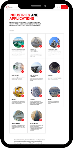
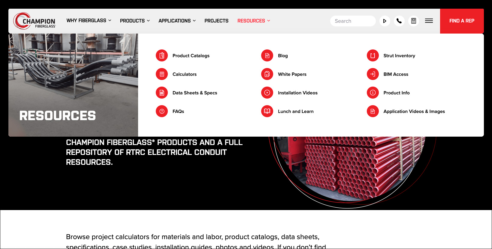
The site navigation was designed with an underlying structure that appeals to the “engineer brain,” utilizing vertical guidelines pulling visitors down the page, while giving elements a clear sense of balance. Information is better organized and allows us to drive more conversions by better understanding users’ needs and giving them the relevant information they need in order to take the next step in their journey (education and product evaluation, rep/sales contact, purchasing decision, etc.)
“I value the expertise and partnership that the Savage team brings to our marketing efforts. Their team is composed of experts in all areas of marketing especially in digital strategies, content development and media buying. They go the extra mile in learning about our customers and have an intimate understanding of our business.
With their integrated, result-oriented campaigns, our company has achieved 50%+ growth for each of the last 2 years. The Savage Marketing team is knowledgeable, responsive, and truly cares about helping their clients succeed – Savage has transformed into more of a partner than our marketing arm. We highly recommend Savage Brands to anyone looking to take their marketing and business to the next level.”
Goran Haag
President and Founder of Champion Fiberglass